
The brown and white National Park sign is one of the most recognizable symbols in American culture. For millions of people, seeing that distinctive brown rectangle with the NPS arrowhead is the moment a road trip becomes something more — it marks the entrance to one of the 406 units of the National Park System, from Yellowstone to the Statue of Liberty.
But the signs are more carefully designed than most visitors realize. The fonts are specifically licensed. The arrowhead is a federally protected trademark. The brown color is a deliberate choice. The carved wooden trail signs use a typeface that did not officially exist as a digital font until 2013. Here is the complete guide.
National Park Sign Colors: Why Brown and White?
National Park Service signs use a distinctive brown background with white or gold lettering. The brown color is not arbitrary — it is a deliberate design choice to distinguish NPS signage from state and federal highway department signs (which are green or blue) and to evoke the natural and historic environments the parks represent.
Motorist Guidance signs within parks are brown specifically to remind drivers they are traveling in a National Park and to distinguish them from standard road signs. The brown color creates visual continuity across all 406 NPS units, from desert parks to coastal parks to urban historic sites.
The exact brown shade used is a standardized color specified in the NPS Graphic Identity and Style Guide — not a generic brown but a specific formulation that must be matched across all official signage materials.
National Park Sign Fonts: Rawlinson and Frutiger
The National Park Service uses two official typefaces on its signage and publications, both licensed for exclusive government use:
| Font | Type | Primary Use |
| NPS Rawlinson | Serif (has small decorative strokes at letter ends) | Main body text on publications; primary entranceway signage |
| Frutiger | Sans-serif (clean, no decorative strokes) | Secondary text; directional signs; visitor information |
| Clarendon | Serif (pre-1990 standard — now outdated) | Still seen on older signs not yet replaced |
| Helvetica | Sans-serif (used 1977-2000 by Massimo Vignelli) | Seen on some park signs from this era — Death Valley entrance uses it |
The switch to Rawlinson and Frutiger happened in 2000, when the NPS hired Don Meeker and Associates to create an official style guide. Designer James Montalbano developed NPS Rawlinson specifically for the Park Service — it is licensed from Terminal Design. Frutiger is licensed from Adobe Systems. Both fonts are controlled by the NPS and not available for general public use through NPS channels.
Before 1968, individual parks were free to choose their own fonts and colors — which is why older signs at parks like Sequoia and Black Canyon of the Gunnison look nothing like the current standard. These historical signs are often preserved rather than replaced, making older park signs a kind of typography museum in themselves.
The NPS Arrowhead: History and What It Represents
Every National Park entrance sign features the NPS Arrowhead — the registered trademark of the National Park Service. The arrowhead shape contains three elements: a sequoia tree, mountains, and a bison. These represent the NPS’s mission to preserve both natural (trees and mountains) and historical/cultural (bison — referencing American natural heritage) resources.
Key facts about the Arrowhead:
- Original sketch: created around 1950-1951 by Dr. Aubrey Neasham, a historian for the NPS western region
- Official adoption: the arrowhead began appearing on NPS signs and publications in the 1950s
- Current version: the arrowhead was redesigned in 2000 by the Dennis-Konetzka Design Group (DKDG) of Washington, DC
- Legal protection: the Arrowhead is a registered and protected trademark of the NPS; its use is controlled by federal law, regulation, and policy
- Permitted uses: only official NPS uses — signs, publications, uniforms, events. Electronic files are for internal agency use only
- Unauthorized use: using the NPS Arrowhead on commercial products or unofficial materials without authorization is prohibited
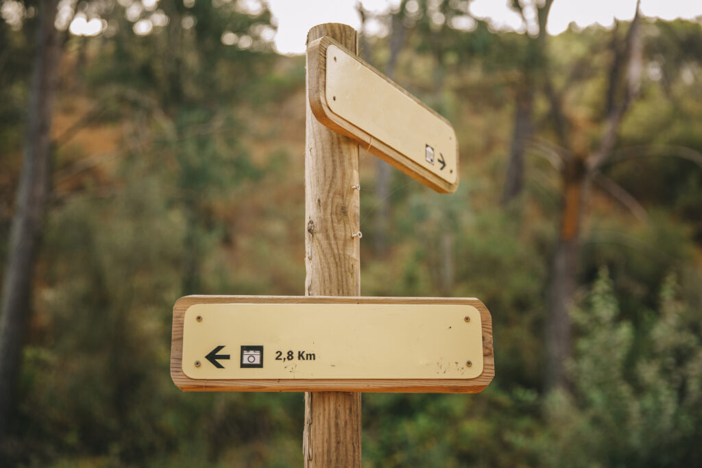
Trail Signs: The Router-Carved Font
The wooden trail signs seen inside National Parks — the directional posts and distance markers on hiking trails — use a different and fascinating design system. The letters on these signs are not set in a standard typeface. They are carved by a CNC (Computer Numerical Control) router that follows a path of points and curves, cutting into the wood. The router’s ‘bit’ creates the letter shape as it follows the carved path.
For decades, this meant the trail sign font did not technically exist as a digital typeface. In 2013, Professor Jeremy Shellhorn of the University of Kansas was working as a designer-in-residence at Rocky Mountain National Park when he discovered no digital version existed. He initiated a class project — the Design Outside Studio — where students made pencil rubbings directly from park signs and used those measurements to create a proper digital typeface.
The result is the National Park Typeface, which is now available as a free open-source font on Google Fonts and Adobe Fonts. It captures the distinctive rounded, slightly imperfect quality created by the router bit process. The font is free for personal and commercial use.
Three Categories of National Park Signs
1. Park Identity Signs (Entrance Signs)
The entrance signs are the most photographed NPS signs. They are located at the main entrance to each park and are designed to embody the character of the specific park. Design standards:
- All must include the NPS Arrowhead
- All must use the official color scheme (brown with white/gold lettering)
- All must use the official fonts (Rawlinson and Frutiger)
- Materials reflect the park’s landscape — stone at Arches, wood in forested parks, metal in desert parks
Some parks have entrance signs that are deliberately non-standard for historical preservation reasons. The Sequoia National Park entrance sign, designed in 1935 by Civilian Conservation Corps craftsman George Muno, features a Native American profile from the buffalo nickel and is preserved as a historic artifact despite not following current NPS standards.
2. Motorist Guidance Signs
Brown directional signs within park boundaries indicating distances, services, and points of interest. These follow standard highway sign format but in NPS brown rather than standard green. They guide visitors to trailheads, visitor centers, campgrounds, and park features.
3. Visitor Information Signs (Interpretive Waysides)
The informational signs at viewpoints, trailheads, and points of interest. The NPS has specific guidelines for these: the sign must capture a visitor’s attention within three seconds. NPS research shows that if a sign does not capture attention in three seconds, visitors walk past. If it does capture attention, visitors typically spend 30-45 seconds reading it. The text must be concise, visually arresting, and not ‘didactic’ (preachy).
Notable National Park Entrance Signs
| Park | Sign Notes |
| Yellowstone | Classic brown and white wood sign; one of the most photographed in the system |
| Yosemite | Simple brown sign at multiple entrances; Arch Rock entrance most photographed |
| Grand Canyon | Modern NPS-standard sign; some older entrance signage preserved |
| Arches | Sign built into local red sandstone to complement the landscape |
| Sequoia | 1935 CCC craftsman-made sign with buffalo nickel profile; preserved historic |
| Death Valley | Uses Helvetica from the 1977 Massimo Vignelli era — not current NPS standard |
| Acadia | Textbook example of current NPS style guide: Rawlinson + Frutiger + Arrowhead |
| Rocky Mountain | Standard modern NPS sign; where the National Park Typeface project originated |
Custom and Personalized National Park Signs
The popularity of the National Park sign aesthetic has created a large market for custom signs using the same design language. Etsy and similar platforms sell personalised ‘national park style’ signs for family names, vacation properties, and gifts.
Legal note: using the actual NPS Arrowhead on a commercial product is prohibited without authorization. However, creating signs that use similar brown and white color schemes, the router-carved typeface (National Park Typeface is freely available), and similar design language — without the official Arrowhead — is legally permissible. Many custom sign makers use the free National Park Typeface available on Google Fonts.
Planning to visit a National Park and need camping information? See our guide to Crystal Cove State Park camping, reservations, and what to know for one of California’s most popular coastal parks.
The official NPS Graphic Identity and Style Guide — including authorized font downloads for NPS employees — is published at nps.gov/subjects/hfc/nps-graphic-identity-and-style-guides.htm.
Download the free National Park Typeface (the router-carved trail sign font) at Google Fonts — National Park — open source and free for personal and commercial use.
Bottom Line
| Sign color | Brown background, white/gold lettering — deliberate choice to differ from highway signs |
| Official fonts | NPS Rawlinson (serif) + Frutiger (sans-serif) — adopted 2000 |
| Pre-2000 font | Clarendon (serif, pre-1990); Helvetica (1977-2000, Massimo Vignelli) |
| Arrowhead designer | Dr. Aubrey Neasham, c.1950; redesigned 2000 by Dennis-Konetzka Design Group |
| Arrowhead contents | Sequoia tree + mountains + bison |
| Trail sign font | CNC router-carved paths; digitized as ‘National Park Typeface’ (free, Google Fonts) |
| Number of NPS units | 406 total |
| Custom signs | Legal without the Arrowhead; National Park Typeface freely available |
Frequently Asked Questions
What font do National Park signs use?
The National Park Service officially uses two fonts: NPS Rawlinson (a serif typeface developed specifically for the NPS by designer James Montalbano in 2000) and Frutiger (a classic sans-serif licensed from Adobe). Before 2000, the standard font was Clarendon (pre-1990) and then Helvetica (used from 1977 to 2000 by NPS designer Massimo Vignelli). Many older park signs still use these legacy fonts. The wooden trail signs use a CNC-router carved typeface that was digitized as the free ‘National Park Typeface’ available on Google Fonts.
Why are National Park signs brown?
National Park signs use brown backgrounds to distinguish them from standard state and federal highway signs (which use green and blue). The brown color is consistent across all 406 NPS units and is specified in the NPS Graphic Identity and Style Guide. It is intended to evoke the natural environment of the parks and to serve as an instant visual signal to drivers that they are entering a National Park area.
What does the NPS Arrowhead symbol mean?
The NPS Arrowhead contains a sequoia tree, mountains, and a bison. These represent the NPS’s dual mission to preserve both natural resources (trees and mountains) and historical/cultural heritage (the bison referencing American natural history). The original design was sketched around 1950-1951 by Dr. Aubrey Neasham, an NPS historian. The current version was redesigned in 2000 by the Dennis-Konetzka Design Group. The Arrowhead is a federally protected trademark — its use is restricted to official NPS purposes.
What is the National Park Typeface?
The National Park Typeface is a free, open-source digital font that replicates the look of the letters carved into wooden trail signs in US National Parks. Those trail signs are made by a CNC router that follows a path of points and curves to carve the letters into wood. In 2013, Professor Jeremy Shellhorn and students at the University of Kansas made pencil rubbings of actual park signs and created a digital typeface from those measurements. The font is available free on Google Fonts and Adobe Fonts.